All too often when people are exploring an interior redesign, refurbishment or refit, they can fall into the trap of ensuring that everything matches and is the same colour. This process often produces rooms which are not only all the same colour, but also, well, just a bit dull.
 Paint companies have noticed this theme within Britain, as a result much of their promotional information has made reference to contrasting colours. Most notably of these is Dulux, who recently provided much information about what colours work together well and encouraged their customers to be bolder in their choices.
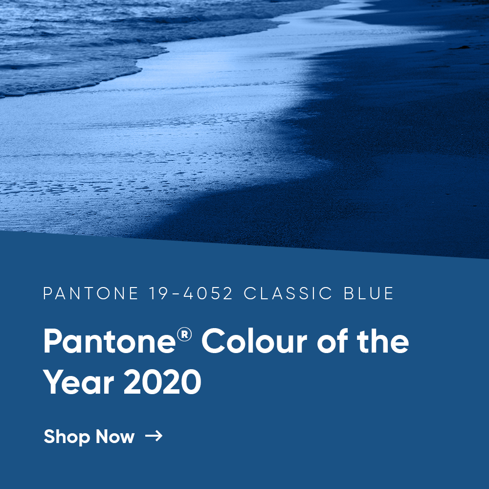
This process is made easy due to the wide range of diverse colour identification systems, such as those produced by RAL, Pantone and Hexidecimal. Each of these systems is comprised of colour charts which offer numerous different colours, tones shades and tints allowing you to select the exact colour you want.
To ensure your selection is accurate and each of the systems is standardized providing the exact same colour each time. This standardisation occurs through a code, each of the three paint companies named above have a different coding system. For RAL it is RAL followed by four numbers. Pantone used a similar system, starting with Pantone followed by four numbers, Hexidecimal however use a hashtag followed by six numbers and letters.
What is perhaps most surprising about each of these systems, is that there is much crossover between the various systems in terms of the colours they contain. For example, RAL 1005 which is referred to a Honey Yellow, is incredibly similar to Pantone’s PANTONE 131 and Hexidecimal’s #A98307. This is not to say that the systems are completely interchangeable, as they offer their own unique colours, Pantone for instance is committed to providing fresh colour palates to reflect contemporary society, but there is some crossover.
When, therefore, you are selecting colour tones and shades for your interiors we suggest you select the colours which you desire and will be compliment any existing interior fittings and furnishings before considering which paint system you select.
For further guidance in selecting colours, especially for details of which provide the best contrasting effect when used in conjunction. Or to gain a more detailed overview of the differences between the existing colour identification systems, a member of our dedicated customer service team can be contacted by calling: 01908 272 855. We can also be contacted by email by clicking here.


